2D Animation | Flash | Learning Task 1 : Kitchen Disaster

So its a simple image, drawn by flash, very little to tell at the moment.
So its a simple image, drawn by flash, very little to tell at the moment.
1) Your “searchability” and “accessability” decreases if you set your type as an image using Photoshop rather than html text.
2) Typekit, Typecast, Font Deck
3) Heading Commands, Font Size Commands, Centering Text, Colour changing, Bolding, ITALIC
4) CSS is a style language that defines layout of HTML documents. For example, CSS covers fonts, colours, margins, lines, height, width, background images, advanced positions and many other things.
5) Aliasing is an effect on any pixel devices, where diagonal and curved lines are displayed as a series of little horizontal and vertical lines. Anti-aliasing, is the name for techniques designed to reduce or eliminate this effect, by shading the pixels along the borders of graphical elements.
6) Google Web Fonts and Adobe Typekit provide free – and paid fronts that are safe and easy to use and trustworthy for web sites to user, this wasn’t the case before Google Web Fonts and Adobe Typekit when the range of safe trustworthy list of fonts were small.
7) Affair, Burgues Script, Parfumerie Script Pro, Engagement
8)
9)


Author: Ayn Rand, ‘The Monument Builders’
Representative of “good” type use

Classic Font, minal change over years.

The colour and contrast helps highlight the easy to read-classical looking font.

A plain white background, and simplistic font.

Large font, as well as easy to read from short to long distances, as well as very simple.

Colourful and bright with simple to read font.
Representative of “Bad” type use

font is too small and the colour could be hard to see with the small font at certain distances as well as a not so simple to read font.

Although you can read the font for “London” the font for “2012” is incredibly bad to read and the shape/outline are so distorted, it is not straightforward.

The shape, size and font type makes this logo extremely hard to read.

The colour difference isnt greater enough to make the “to everywhere” stand out, and the background noise is too much.

Poor positioning of text.

Author: Ayn Rand, ‘The Monument Builders’

Typeface: Vast Shadow. Designer: Sorkin Type Co. History and character: Vast is a Victorian slab serif advertising type. Vast has a feeling of sturdy solidity combined with just a little bit of refinement. Because Vast Shadow has a thin shadow that won’t display well at small sizes we recommend that you use it from 32px and larger…being created in 2013, Vast shadow has very little history.

The Facebook page exhibits The Gutenberg theory of flow. The Title “Facebook” is situated near the left hand side, and is in large bold text. with the users eye Flowing diagonally rightwards to the bottom right hand corner showing a bold and large sign up title. The amount of eye catching images are limited to the centre of the page. The use of grid is very evident being a news site.

Print-publishing (magazines / newspapers)

Street advertising (billboards/ shop-frontage)

Billboard

A Website

Your choice

Logo

Built Environment

Natural Environment

Human Anatomy

My Choice

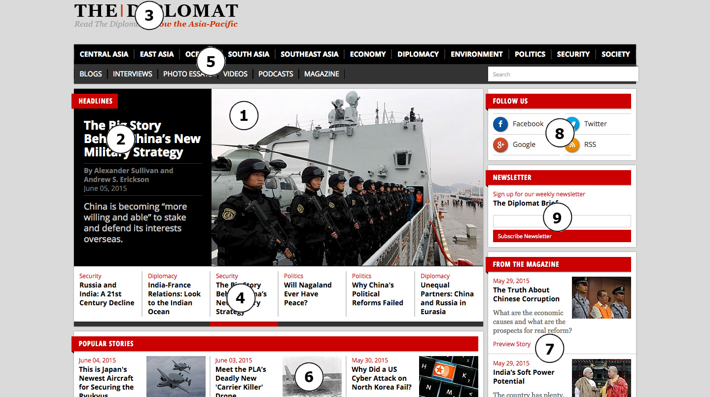
1) Photo is large, and in the middle. 2) Big text related to the large Photo. 3) A even larger text however this is not the centre of the page and might be overlooked at first look. 4) small stories under number 1 and 2 5, 6, 7, 8, 9) are all minor, with similar size and text.
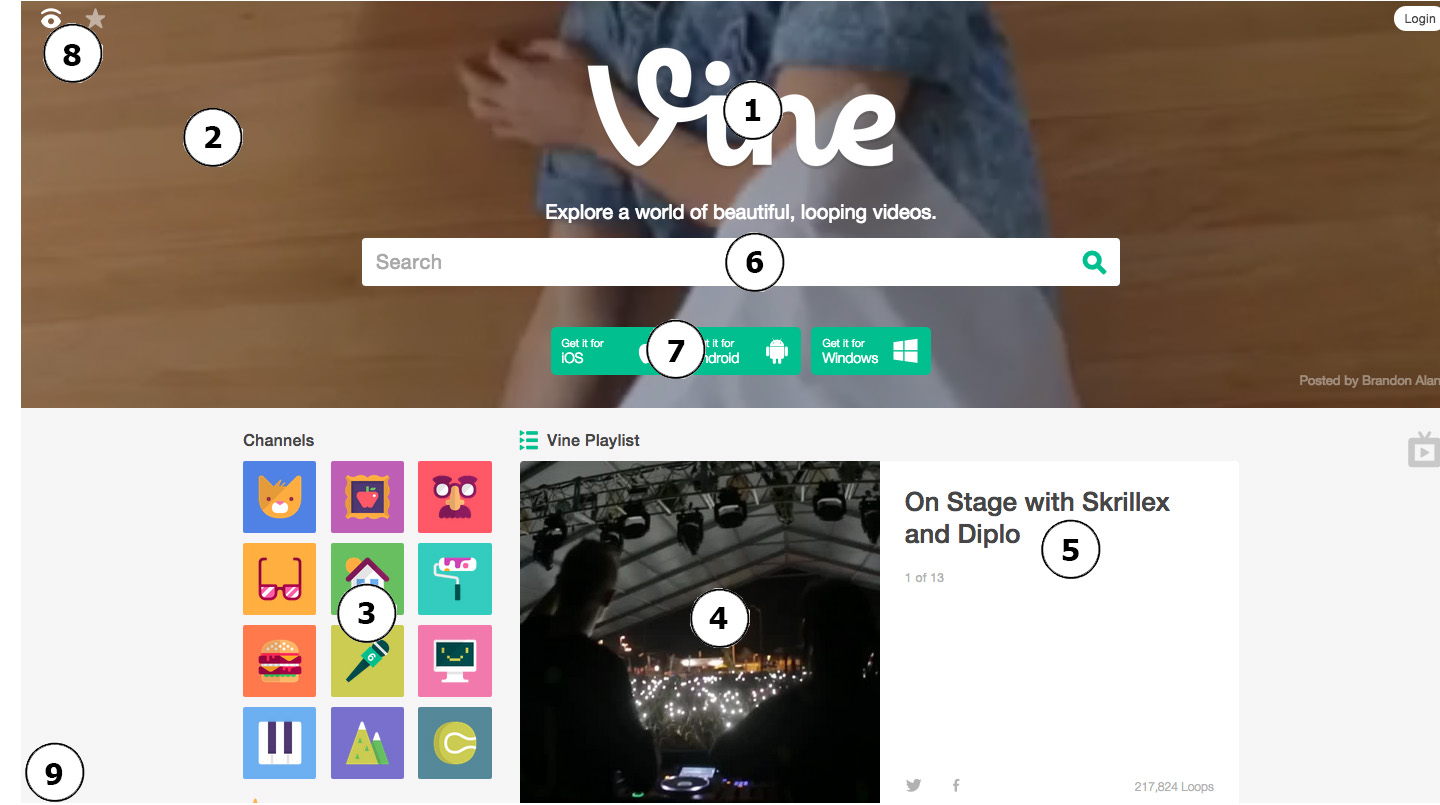
1) The photo is big, in the middle 2) several small vine videos in the background, although i would think this should of been No.1 i found that the large “Vine” was caughting my eye more. 3) bright colors, very eye catching. 4) a smaller video 5) text to go with the video. 6) centre in the middle, but as a low profile. 7) similar to No 6 8) some small icons
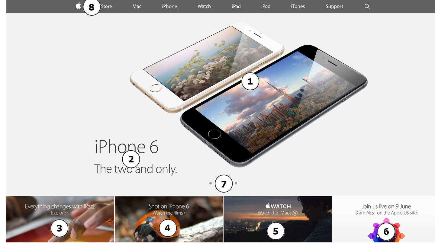
1) a very large image 2) a great size font 3,4,5,6) smallish photos with beautiful text.
